
Club Discount: As we stated from the beginning, the RMEC will discount these shirts for club members below cost. Because the club is "eating" the difference we need to limit the number of discounted shirts each member can order to two shirts. If not, this will quickly depleat our membership budget. You are welcome to order more, but you will need to pay our price (which is already discounted because of the volume we are ordering). More details will be available on pricing in the next blog post.
Logo Change: I had hoped to refresh the RMEC logo for the next shirt order. I wanted to keep it similar in style (because it is recognizable), but update it some. Below is our current logo, and a proposed logo. Don't worry about the colors. This is just what it was designed in. The logo will be B&W in our shirt order.

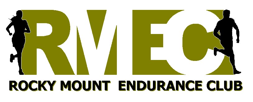
Here are the changes (current logo is on the top, proposed logo is on the bottom)
- Two new runner images.
- Letter R is not cut off, and there is a little more white space between the M and the E
- Text below now has a drop shadow instead of two color words
- Removed Rectangle
So take a minute to vote (yes. . . another poll) on which logo you prefer.
Love the new logo--looks great!
ReplyDeleteI like the new one too. Arthur
ReplyDeleteI vote for the new one.
ReplyDeleteOh ya! The new one looks faster!
ReplyDeleteBrian
New one definitely...good job!
ReplyDelete-Margaret
I like the new one too!
ReplyDeleteAnd I'll be happy to pay full price for my shirts.
Oooops, I voted for the wrong one. :) I like the new one too. kp
ReplyDeletenew one is great.
ReplyDeleteI like the new one. great job!
ReplyDeleteI agree the new one looks faster-but we will need to order and race it to be sure...... but I think it looks faster!!!
ReplyDeleteTracy H
i like the new logo...cliff
ReplyDeletei like the new logo...cliff
ReplyDeleteI think the girls look fast in both. I like the new one too.
ReplyDelete